Caterwise / Turura - A full identity refresh for a retail brand, including a visual system that extends to house branded packaging.
Project Year 2025 | Brand Positioning, Visual Identity System, Packaging
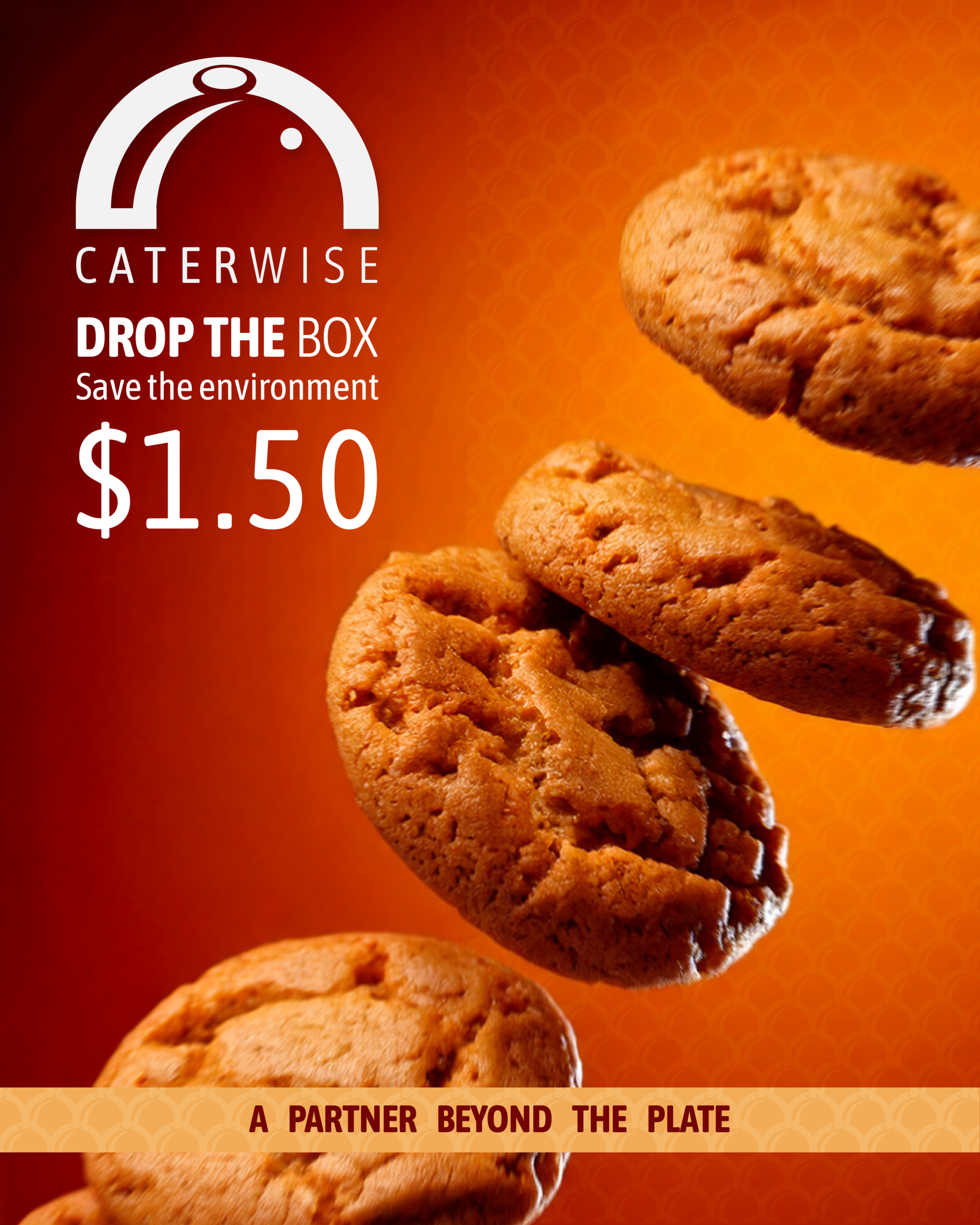
Caterwise (Turura Trading) spent 10 years growing into a well known retailer, with multiple locations and an expansive product offering. They needed a complete brand refresh to reflect their growth and reposition their brand as they extended their offering of in-house brands.
After a deep dive into their history and where they saw their future, we settled on the Cloche design representing the nature of the business and forming the foundation of the extended visual identity. The Cloche logo consists of three core elements:
The “C” shape representing the “Caterwise” name, the cloche serving dish to symbolise the service-oriented nature and their capacity to supply industrial scale customers as well as the general consumer, and finally the olive to preserve the connection to their original logo.
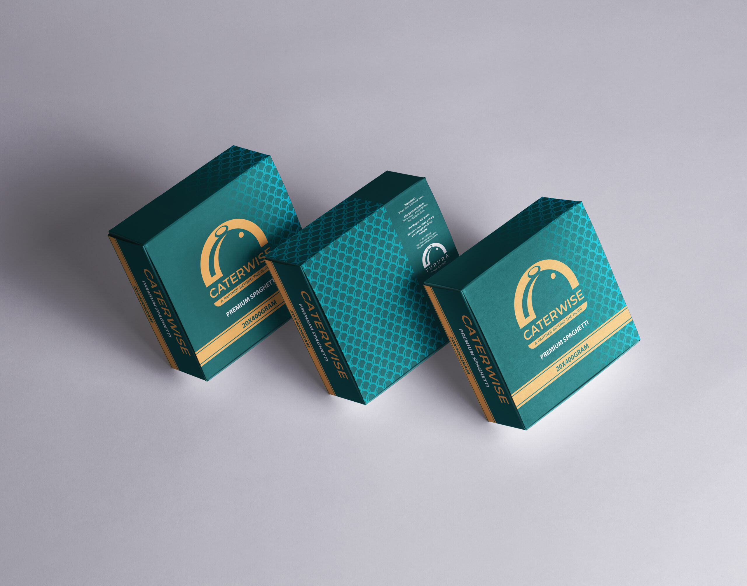
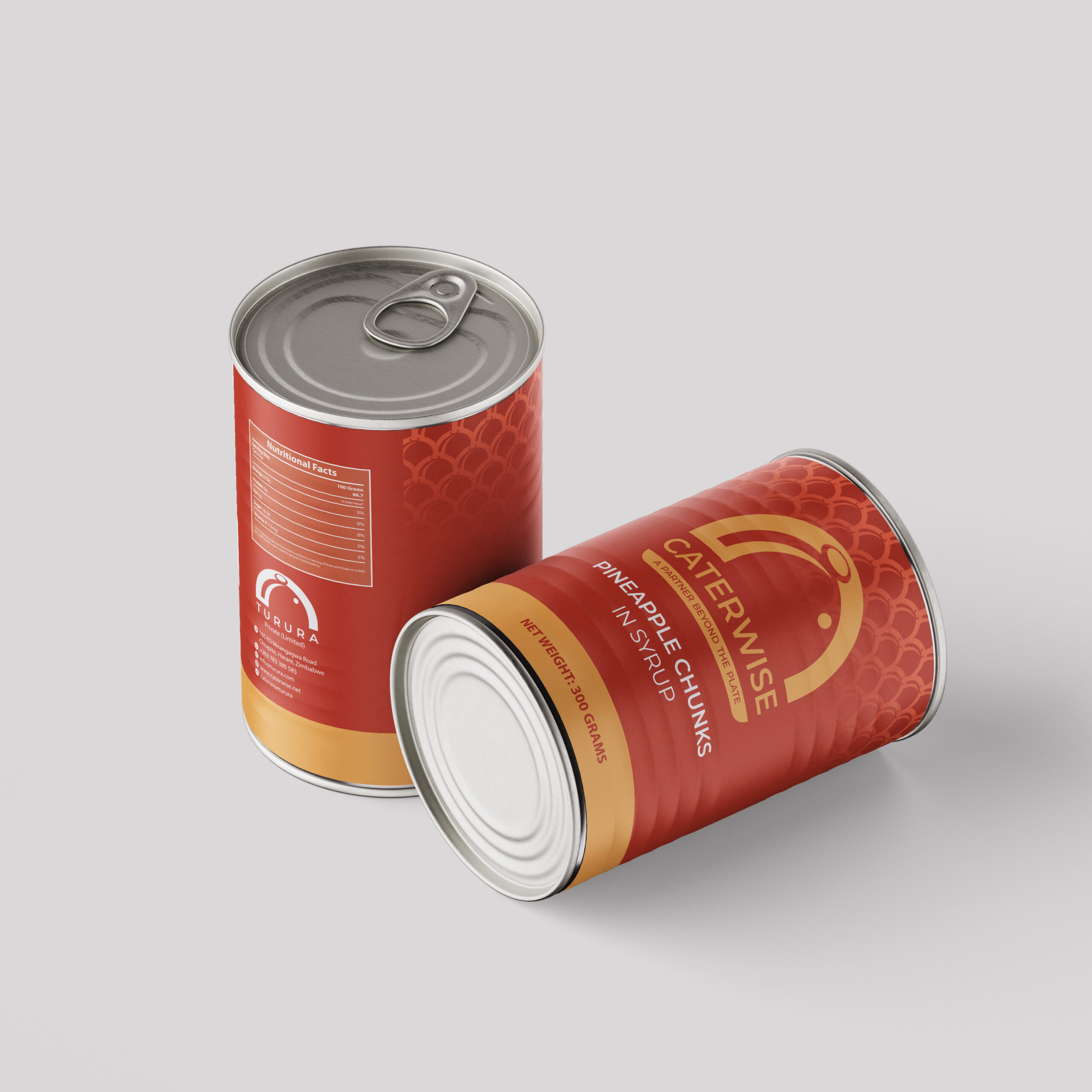
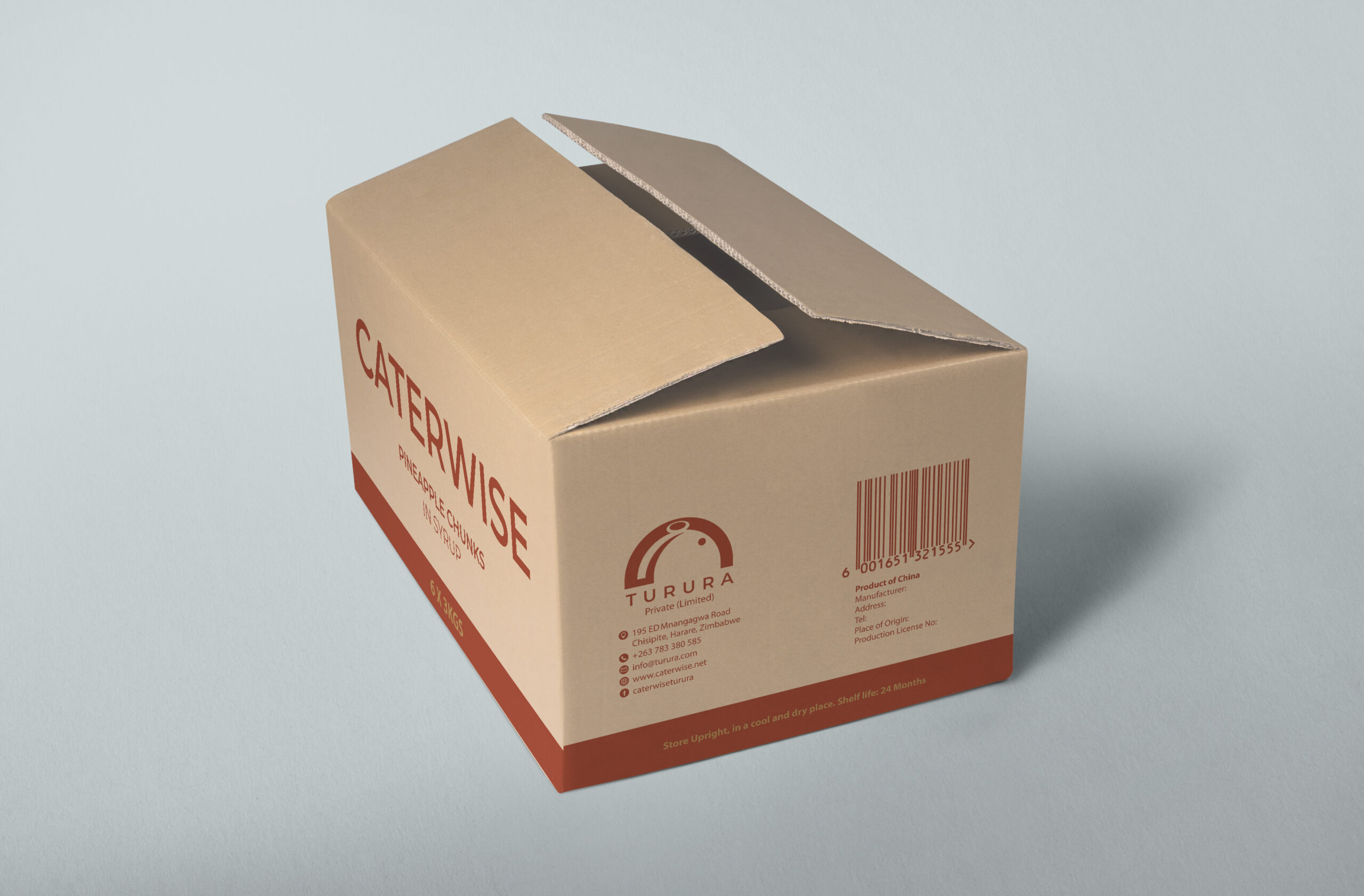
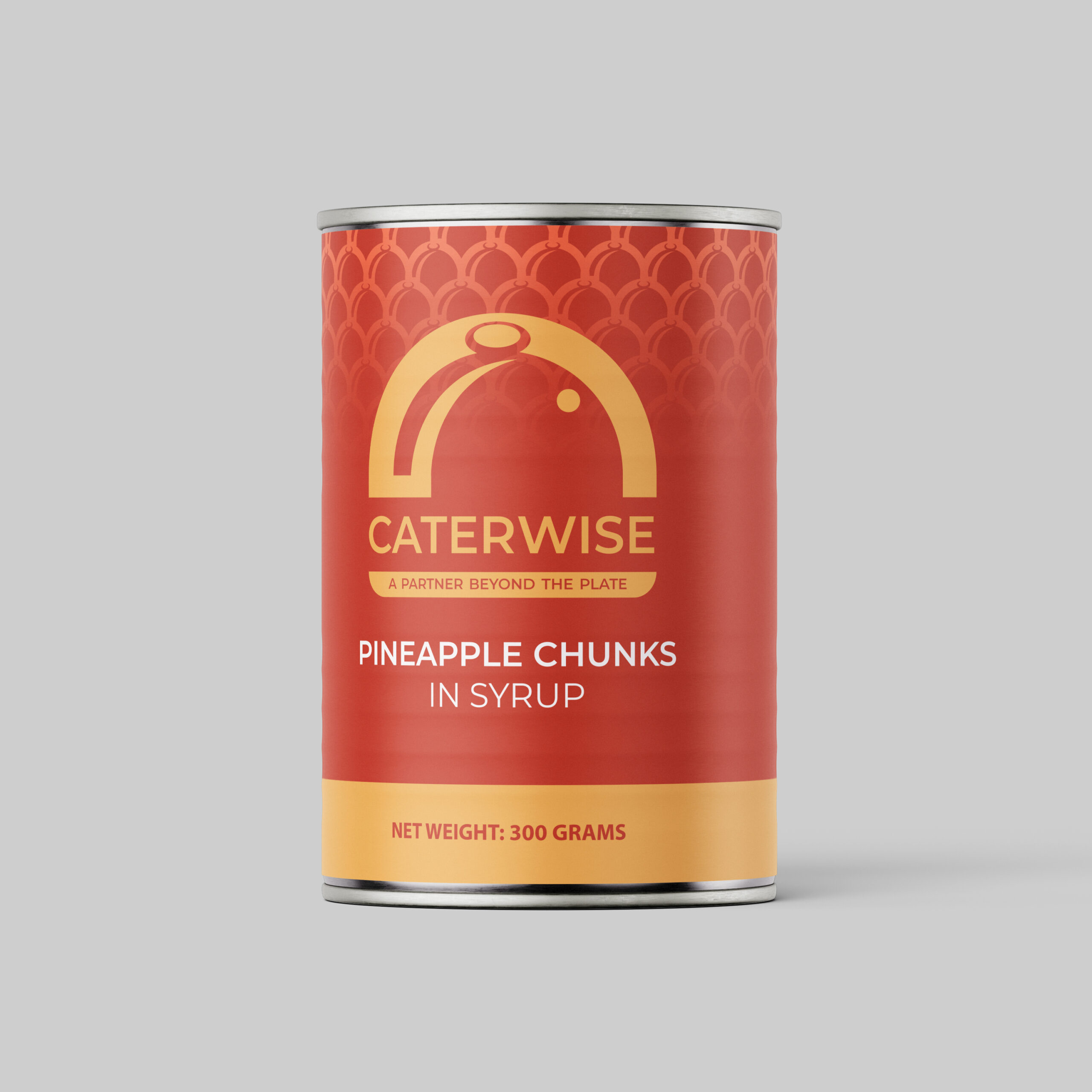
Colour - a robust palette to accommodate their growing product line.
Hex:06344F
RGB: 06 | 52 | 79
Hex:074561
RGB: 07 | 69 | 106
Hex:0A5353
RGB: 10 | 83 | 83
Hex:730303
RGB: 115 | 03 | 03
Hex:BF3604
RGB: 191 | 54 | 04
Hex:F2AC57
RGB: 242 | 172 | 87
Hex:231F20
RGB: 33 | 31 | 32
Hex:5E6B69
RGB: 94 | 107 | 105
Hex:858E8D
RGB: 133 | 142 | 141
Hex:485654
RGB: 72 | 86 | 84
Hex:B3B4B4
RGB: 179 | 180 | 180
Hex:D4D8D3
RGB: 212 | 216 | 211
Hex: #06344F
RGB: 195 | 146 | 46
Hex:074561
RGB: 25 | 201 | 38
Hex:0A5353
RGB: 244 | 224 | 156
Hex:730303
RGB: 226 | 198 | 117
Hex:BF3604
RGB: 251 | 204 | 52
Hex:F2AC57
RGB: 255 | 232 | 155
Typography - Montserrat (wordmark)
A modern geometric sans-serif typeface chosen as it combines sophistication with clean, contemporary lines while being versatile and confident. Perfect for conveying clarity and approachability.
Aa Bb Cc Dd Ee Ff Gg Hh Ii Jj Kk Ll Mm Nn Oo Pp Qq Rr Ss Tt Uu Vv Ww Xx Yy Zz 1 2 3 4 5 6 7 8 9 0 ! @ # $ % & – + ?